AI-Slop Websites Are Everywhere. Here’s How to Make Yours Look Human Again
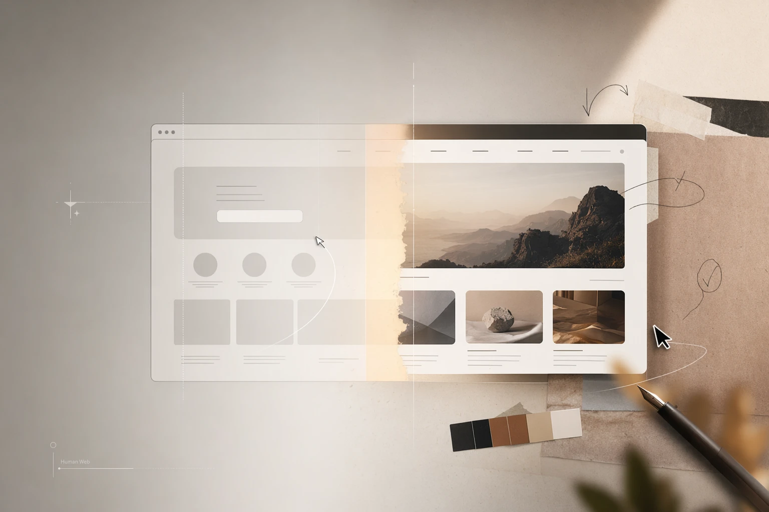
AI can generate a website in minutes. That is no longer the impressive part. The new problem is making sure it does not look like every other website generated in minutes.
There is a new kind of design fatigue online. You have probably seen it: soft gradients, rounded cards, vague hero copy, floating product mockups, cheerful icons, and a headline that sounds confident without saying much. It looks polished enough to pass a quick glance, but strangely empty when you actually read it.
This is the web design version of AI slop. It is not always ugly. In fact, that is what makes it tricky. It is often clean, balanced, and technically acceptable. The problem is that it feels interchangeable. You could swap the logo and sell a productivity app, a coaching service, a crypto dashboard, a design studio, or an online course with almost no change.
The current wave of AI website builders has made first drafts incredibly cheap. That is good. But cheap first drafts create a new responsibility: the human part of the workflow has to move from production to direction. You are no longer asking, “Can I make a website?” You are asking, “Can I make a website that carries a point of view?”
Why AI Websites Start Looking the Same
Most AI-generated websites converge because the prompt is vague. “Make a modern landing page for my startup” gives the system very little to work with. When the input is generic, the output becomes a statistical average of what a modern landing page usually looks like.
That average has a visual language: big hero, generic subheadline, three feature cards, testimonial row, pricing card, FAQ, CTA. There is nothing wrong with that structure. The issue is that structure alone is not a brand, not a story, and not a reason to care.
Another reason AI websites feel similar is that users often judge the first screen too quickly. If the hero looks clean, they stop. But a real website has to survive deeper inspection: does the copy say something specific? Does the page answer real objections? Does the visual system fit the audience? Does the call to action make sense? Does the site feel like it came from this company, creator, or project?
Start With Taste, Not Decoration
Taste is not the same as aesthetic preference. It is the ability to choose what belongs and what does not. For a website, taste means knowing which parts of your story deserve attention and which parts are noise.
Before you generate anything, write down what should be true about the page. Not “minimal” or “premium.” Those words are too slippery. Try: the page should feel practical, not luxurious. It should make a solo consultant look trustworthy without pretending to be an agency. It should make a small product feel focused, not overfunded. It should make a newsletter feel useful, not inspirational.
That kind of direction gives an AI workspace something to preserve. In folkos.ai, the useful workflow is not to generate and accept. It is to generate, inspect, edit, and remix until the page starts to sound and behave like the actual project.
The Anti-Slop Website Checklist
Make the hero say something testable. A weak hero says, “The future of work is here.” A stronger hero says who the page is for, what problem it solves, and why the visitor should keep reading.
Replace generic features with real use cases. “Fast, flexible, powerful” can describe anything. “Turn one campaign brief into a landing page, newsletter, launch deck, and social assets” describes a workflow.
Use fewer visual tricks. If the design depends on glow, blur, oversized cards, and gradient noise to feel interesting, the underlying idea may not be strong enough yet.
Write for one kind of visitor. Generic sites try to welcome everyone. Useful sites make a specific person feel recognized.
Show the actual thing. For a product, show the product. For a portfolio, show the work. For a newsletter, show examples. For a service, show process and outcomes. Mystery is not a conversion strategy.
How to Use AI Without Losing Originality
The trick is to stop treating AI as the designer of record. Treat it as a fast collaborator that needs constraints. Ask it for three directions, not one. Ask what each direction implies about the audience. Ask which parts feel generic. Ask it to rewrite sections for a narrower reader. Ask it to remove anything that could appear on a competitor’s website.
Then build from the best parts. A strong AI web design workflow is less like ordering a finished poster and more like editing a draft with a very fast assistant. The quality comes from the loop: brief, generate, critique, revise, reuse.
This is why an AI workspace matters. A single generator gives you an output. A workspace lets you keep the thinking, edit the structure, reuse the copy, and turn the same source idea into a blog post, email, deck, ecommerce page, or content plan.
SEO Without Sounding Like SEO
Search optimization does not require your website to sound robotic. In fact, the more AI-generated the web becomes, the more useful specificity will become.
If your page is about AI website design, say what kind: AI website design for creators, AI website design for small business, no-code website design for portfolios, ecommerce landing pages, newsletter websites, personal websites, or product launch pages. The specificity helps search engines, but more importantly, it helps readers decide whether the page is for them.
Good SEO pages answer the question behind the query. If someone searches “how to make an AI website look less generic,” they do not need a sales pitch. They need examples, principles, a checklist, and a workflow they can actually follow.
The Human Part Is the Advantage
AI has made web production cheaper. That does not make taste cheaper. If anything, taste becomes more valuable because production is no longer the bottleneck.
The websites that stand out in the next phase will not be the ones with the most dramatic animations or the fanciest model behind them. They will be the ones that feel specific: written for a real visitor, shaped by a real point of view, and connected to a real workflow.
If your first AI-generated website looks too familiar, do not throw it away. Use it as the draft. Then make it yours.
Folkos: The agent workspace, reimagined.
Build once, remix everywhere.
Get started free →